

New GNOME dialog on the right:

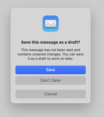
Apple’s dialog:
They say GNOME isn’t a copy of macOS but with time it has been getting really close. I don’t think this is a bad thing however they should just admit it and then put some real effort into cloning macOS instead of the crap they’re making right now.
Here’s the thing: Apple’s design you’ll find that they carefully included an extra margin between the “Don’t Save” and “Cancel” buttons. This avoid accidental clicks on the wrong button so that people don’t lose their work when they just want to click “Cancel”.
So much for the GNOME, vision and their expert usability team :P
I don’t hate it, it looks better than what was there before, no doubts there, but at the same time they could’ve just made it better.
All the literature on action buttons with dangerous effects tells you to add margins, accents and shades. Any design undergraduate should be aware of this, however the GNOME team totally missed it.
It’s funny that you mention that because…
I’m totally okay with “being inspired” (cloning) macOS, it should be viewed as good thing because Apple does spend a lot in UX research however lets make thing properly.
How? Improving something like this is hard. Do you have any proposals?
I’m afraid to tell you that in 2024 nobody cares about that. “Shape following feeling” in MD is the best example I can think of. Now aesthetics is preferred to make people buy (or use for free in this case) the product. People are not tech savvy. They want good looks and GNOME nailed it imo. It’s stunning. They even got me but I do care about aesthetics unfortunately. I’m a spoilt mass consumer. Eject me if you will.
Accent color taboo. Let’s not talk about accent color.
I’ve submitted a fair share of UX in-depth analysis with examples and links to literature on the GNOME team blog and they tend to ignore / comment dismissingly and then remove my comments after a few weeks.
Ahahaha
Judging from your post and replies, you look very aggressive, rude and demanding so no wonder the devs deleted your comments.
To be fair, he could also just be fed up after a long time being ignored for what he thinks is quite an important design decision.
May be but some of this user’s post history is a bit questionable.
In-depth analysis ≠ random ramblings on lemmy.