• 0 Posts
  • 120 Comments
Joined 1 month ago
cake
Cake day: February 28th, 2025

help-circle
  • Yeah! That I very possible! Again, I can only guess and refer to tendencies I have noticed in myself when practicing Cyrillic, but since I haven’t seriously committed to learning Russian or any other language with non-roman letters, I can only guess what it would be like. I only started practicing it because I was developing fictitious languages at the time and wanted to broaden my horizon. Only reason I stopped was because life got hectic af and I haven’t had the time and energy for a year and a half to have hobbies or interests or really anything other than working. I’m slowly moving into hobby and interest territory again now that life is a tiny bit less insane, so maybe I will pick Cyrillic back up. I remember taking a sneak peak on Mongolian script as well and that shit looks like vertical elvish, wtf. So pretty.

    Hmm… that’s actually a good question! I have never thought about punctuation but come to think of it I do see some of them in color too. I just tend to ignore them since they are just punctuation. For example ? is white and black while " is brown. It isn’t all symbols that have colors, though. # doesn’t have a color. Periods are black and dashes are creamy yellow. I don’t know if they make a difference when it comes to how I perceive color in a sentence. I thin question mark is the only one I have really noticed because the white is dominant. With the others I just haven’t thought about whether or not they affect my perceptions. I think they do. Kinda like how you know what Mickey mouse looks like but if you were to draw him from memory you would be a but like “uuuuuh…” because you haven’t ever really studied his design, you just recognize it and know it’s him when you see him.

    That’s kinda how synesthesia is for me too. I know that B is blue and dashes are creamy yellow etc, but I don’t think about how it looks in sentences until I have to actually study it.

    I did try to test it last night with a short sentence and how different types of punctuation affected it. I learned that commas and periods and so on don’t really make a difference while questionmark and three periods does have an effect on the color I see.

    As for the rest I can’t say how or if they affect it. The color stuff is very intuitive and organic and I try to stick to the ones I’m certain of while the unclear ones just get labeled as colorless. Even if I see a color with the colorless ones, it’s too unstable for me to be certain with some. For example, the letter F is super tricky. It has like three different colors and kinda flickers for me. Depending on the words F appears in, it will take one of the three colors, but by itself it flickers black, dusty blue and a beige brown. J also flickers between black and blue. So those two letters are colorless to me, even though they technically aren’t.

    Sorry if it got a bit weird and random in the end. I’m a bit tired and my thoughts are all over the place haha.

    I hope you have a wonderful weekend, friend!


  • Well, you get boring human writing instead:

    “Inaction Man! There’s a seven story building burning with kids and kittens on the top floor!”

    Inaction Man scratches his belly and pops another potato chip into his mouth.

    “Have you considered calling the fire department instead of me? They are doing reruns of the Sopranos so I’m busy.”




  • Correct! But that is just how it is to me. Other synesthetes may process letters differently because they use sound or smell or texture or taste etc. It’s a very individual thing.

    I think that the ochre/yellowish color appears to me when I look at の because it reminds me of E or rather “e” and to me E/e is a pale yellow. I’m definitely informed by my established understanding of letters in the Roman alphabet, but the color isn’t a one to one copy paste because の and e are still different enough that the colors will be different too.

    I started teaching myself the Cyrillic alphabet a few years ago, but got busy with life so I have since forgotten most of it again, but I do remember some of the letters taking on interesting colors for me. Most of the letters in the Cyrillic alphabet LOOK like Roman letters even if they have completely different sounds so many of them just get the color from the Roman alphabet, but some of them are just different enough that the color is unique to them. Correct! But that is just how it is to me. Other synesthetes may process letters differently because they use sound or smell or texture or taste etc. It’s a very individual thing.

    I think that the ochre/yellowish color appears to me when I look at の because it reminds me of E or rather “e” and to me E/e is a pale yellow. I’m definitely informed by my established understanding of letters in the Roman alphabet, but the color isn’t a one to one copy paste because の and e are still different enough that the colors will be different too.

    I started teaching myself the Cyrillic alphabet a few years ago, but got busy with life so I have since forgotten most of it again, but I do remember some of the letters taking on interesting colors for me. Most of the letters in the Cyrillic alphabet LOOK like Roman letters even if they have completely different sounds so many of them just get the color from the Roman alphabet, but some of them don’t really look like Roman letters and while I was learning, they started to take on their own unique color. Since I still don’t have a solid grasp on the Cyrillic alphabet, the colors are also very flimsy and hard to pin down. In the same way that it is hard for me currently to remember what sound goes with what letter.

    But л which has the L sound, generally tends to flicker yellow and reddish pink to me atm. Maybe if I got really good at Cyrillic, it would become more yellow or more reddish pink or maybe, as my understanding of the letters grow, it will take a completely different color? I don’t know. I haven’t learned a - to me - foreign alphabet with language well enough to be able to tell you what happens there. I also don’t remember how colors of the Roman letters were formed for me because when I learned to read and write I was a kid and I didn’t know that how my brain works was a bit different in some areas so I guess the colors just came gradually and naturally and I didn’t think about it until probably my early 20s when I had a history teacher who randomly brought the topic up in class and asked us if we saw colors when we look at letters and words. Me: oh yeah, but don’t everybody?

    Also, don’t apologize for asking questions :D


  • That is awesome!! My version of “room” isn’t too different from yours, actually! Black, white and dark, rich forest green. Im pretty jealous that you have so many blues and pinks. Urgh, lucky!

    And I totally get what you mean! 8 is dark purple but eight is bright yellows and whites, with a bit of beige in there somewhere before ending a little spot of black.

    Well, for me, the colors show up in ways that tend to make them appealing or unappealing, so for example, I’m normally indiffernet to a plain orange color, but when I see the letter Æ, it is orange like a sunset. Shining, vibrant, light and shadow ripples through it like leaves in front of the afternoon rays. Almost everytime Æ appears in a word, it gives the word an afternoon, golden hour quality that makes the word prettier than normal. The Danish word længes (longing) pretty much has the color combination of you walking through a beech forest in the afternoon sun in May. The browns, the greens and the orange and the gold makes it one of the most beautiful words in the Danish language to me.

    Meanwhile the word lærer (teacher) just has a regular flat orange and is surrounded by blacks and browns and isn’t the most appealing word to me for that reason. If the Æ had somehow managed to get the space and support from the other letters to become the afternoon color, then maybe I would like lærer better?

    There are other words that are incredibly ugly and either have dull or clashing color combinations like høreapparat (hearing aid) which is a distressing combination of a dry, desaturated brown clashing with a more rich, reddish brown, then black and vibrant red and a yellowish orange and then some reds and blacks at the end. Hideous word. Any time r’s, a’s, ø’s and h’s are put together I see puke colors and we have those letter combinations in plenty Danish words so that’s fun. And yet, sometimes it just works too. Ørsted is sleek. The brown is almost consumed in a pure black, the red is bold and fresh and there’s a little spark of a pale morning yellow in there to give it a bit of life. When the colors are clean, I like it. But with høreapparat, it’s just muddy, ugly colors that don’t fit together at all.

    My personal favourite color is green, but I have so many green words and in various shades of green too, that I am bored of green when it comes to my synesthesia. Pinks, blues and purples are much more interesting to me in that context because they are so rare.


  • I am sure there are some of those out there! I saw a guy online who had color and shape based synesthesia with letters and numbers and he had built is own alphabet from that and actively used it for note-taking. He seemed exceptionally intelligent and his notes were a complete trip to look at. Some people called him schizophrenic in the comments because they didn’t understand it, but it was very clear to see that there was a logic and a system to his alphabet and his notes that wouldn’t have been there if he had schizophrenia. People fear what they don’t understand xD

    I wish I could remember where I saw that. It was awhile ago. It was so cool.

    From what I have been able to tell, many people with synesthesia are either artists or scientists. I’m sure there are also bankers and accountants with this affliction out there, but I guess you don’t hear about them as much as they don’t tend to become famous.


  • Haha yeah, I wouldn’t be able to tell you as of now! The closest I get to tell you what it looks like when strokes that stand for different things merge together is with the letter Æ. A is red, E is a pale yellow so Æ is orange, but on a gradient from brown to bright orange. Very pretty letter and very dominant in words.

    We also have the letters Ø and Å in my language which stand for “oe” for Ø and “aa” for Å. These are different, though, as their designs don’t really show the combination of the letters like it does with Æ. O for me is white, sometimes with a light creamy yellow tint to it. E is, as I said, a pale yellow but Ø is the color of darker amber. A is red, but Å is a dusty blue and light pink, like a morning sky.

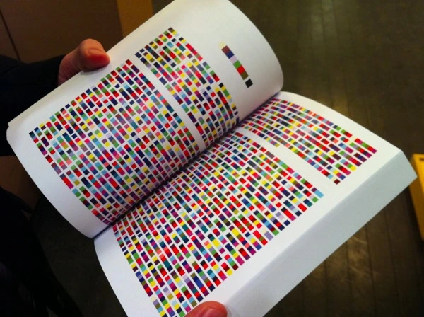
    So if I learned Chinese, I’m sure the colors of their characters would be very intricate and probably take a different shape too as I’m used to seeing words in horizontal color codes similar to this:

    But I suspect that because Chinese words are built more like in boxes, the color combinations would imitate their shapes too and that would be kinda cool to experience, I think. It would still be a largely useless ability, if you can even call it that, because I rarely use my synesthesia for anything other than remembering spellings and such.


  • In my case it does nothing for my understanding of math. I am pretty bad at math so my synesthesia would only benefit me with numbers if I was good at calculating things in my head. Then I would probably see the color of the number before getting the facit.

    With words it can be helpful with spellings. If I or someone else misspell a word I see it immediately because the color is wrong. This is also how I remember people’s names. I tend to ask people how their names are spelled so I see their colors correctly. To me, that’s part of knowing someone. If I haven’t seen someone’s name written in front of me, they won’t have a color and I then tend to forget their names, which is super awkward sometimes.

    With some words that can be spelled in different ways, I prefer some spellings over others because the color is prettier or more appropriate.

    For example with gray and grey I prefer grey because the color of that word is light grey and a very light yellow. Gray is a dark, denatured brown and red. I don’t like it as much.

    But yeah, when it comes to math, it does almost nothing for me because I’m not mathematically gifted at all.


  • In that sense there is a logic to synesthesia. It’s often sensory inputs experienced in childhood that gets mixed up and associated with one another so the fact that the thunderbirds have affected your number colors makes complete sense to me!

    I’m pretty sure that A is red and B is blue to me because vocals are usually marked with red and consonants are marked with blue so the fact that the first two letters of the alphabet adheres to that rule makes sense to me. But I couldn’t tell you why C is a pastel yellow, D is a blackish purple or why E is pale, almost white yellow etc.


  • Makes sense! I tend to prefer good films too. I can watch a bad horror flick now and again, but I do prefer movies that want something from me. I have a few people I used to refer to for movie recommendations on youtube. Not because I agreed with their tastes always, but because they were pretty good at finding movies I hadn’t heard of and since I knew their tastes I would also know approximately what I would think about this or that film. Haven’t really kept myself updated on the horror landscape in recent years because life is busy. That has bit me in the ass a few times.

    Most recently, I goofed and drug my boyfriend to the cinema to watch The Monkey because I had heard that it was super scary and very creative. I must have been trolled because that film was probably the worst Stephen King movie I have seen since The Dark Tower. Holy shit. If it wasn’t for the fact that we had bought tickets to see it, we would have left after the the babysitters funeral. Holy shit it was awful. It was the worst kind of horror comedy. I’m sure you know what I mean.


  • What is a pretty looking name or word to you? Also, what are the colors of the numbers to you? Some synesthetes have really awesome colors while I feel like mine are pretty lame most of the time xD so many black and white and green and red letters. So few yellows and blues and pinks and purples. It’s tragic lol.


  • That is actually a very interesting question and I think it entirely depends on what senses triggers the synesthesia. For me, it is the look of the letters that determines what color they get. I still have to know what sound they make and understand what they mean and such before the colors start to come. Otherwise it is just a nonsensical pattern and my mind ignores it.

    If I learned Japanese, I’m sure their writing system would have different colors to me. I can answer you on the の because it is one of the only Japanese characters I understand and know and to me it is yellow, almost a light ochre with a bit of white in it while “no” is green and white.

    It would be differnet for someone who sees words in colors if their synesthesia is based on sound. To them, maybe the の would have the same color as the “no” or maybe it would be different because the English “no” is pronounced differently than the Japanese “no”. But I can’t give a definitive answer on that one.