Innerworld@lemmy.world to Data is Beautiful@lemmy.worldEnglish · 16 days agoHow the audiences of news sources differ in their levels of educationwww.pewresearch.orgimagemessage-square3linkfedilinkarrow-up122arrow-down10file-textcross-posted to: mildlyinteresting@lemmy.world
arrow-up122arrow-down1imageHow the audiences of news sources differ in their levels of educationwww.pewresearch.orgInnerworld@lemmy.world to Data is Beautiful@lemmy.worldEnglish · 16 days agomessage-square3linkfedilinkfile-textcross-posted to: mildlyinteresting@lemmy.world
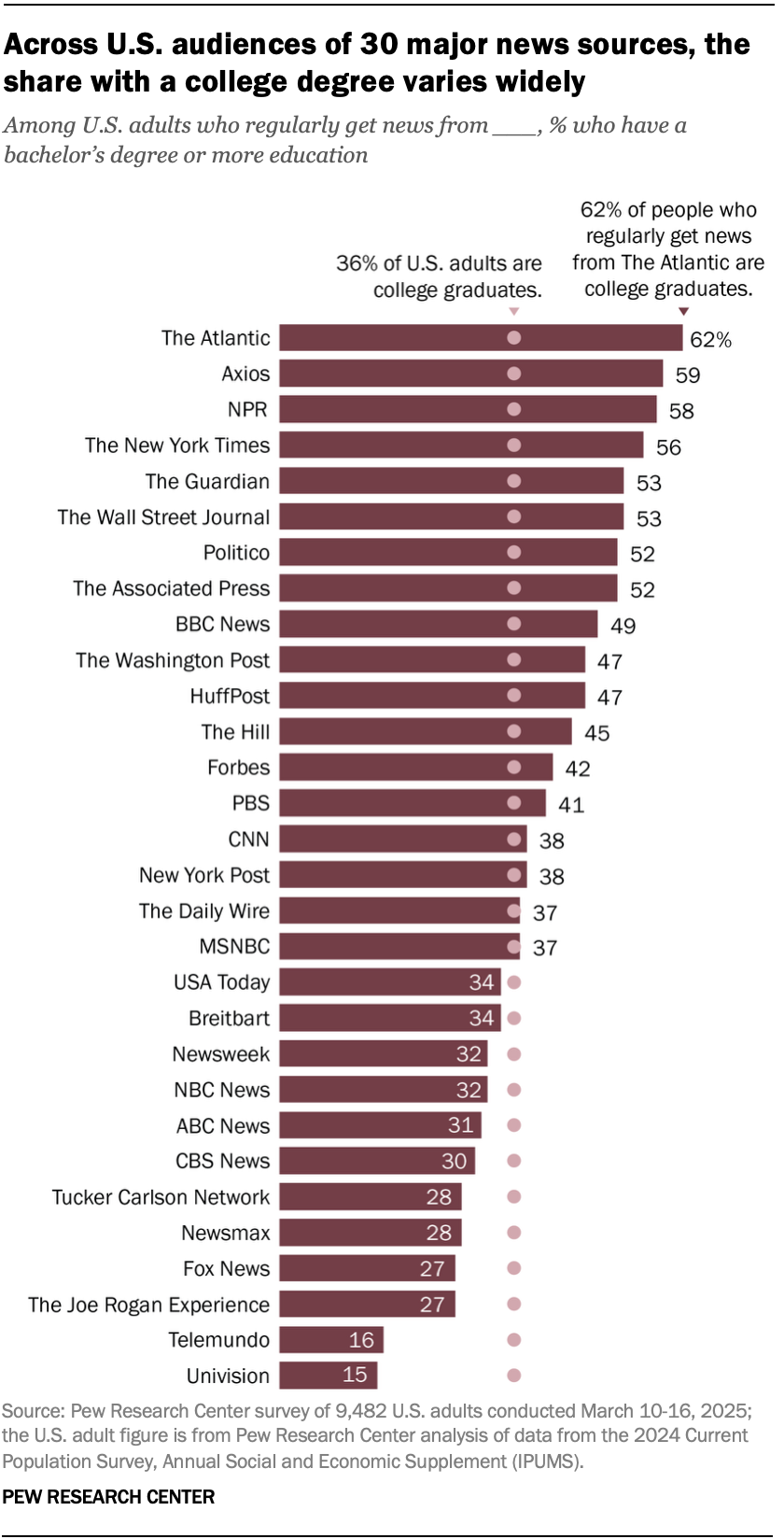
minus-squareyesman@lemmy.worldlinkfedilinkEnglisharrow-up7·16 days agoThe pattern I notice is that all the paywalls are heavily weighted toward the top of the chart.
minus-squareEonNShadow@pawb.sociallinkfedilinkEnglisharrow-up3·15 days agoAlso that 27% of people primarily use Joe Rogan and Fox Lines up with Gestures to every other datapoint about 27% of the US
The pattern I notice is that all the paywalls are heavily weighted toward the top of the chart.
Also that 27% of people primarily use Joe Rogan and Fox
Lines up with
Gestures to every other datapoint about 27% of the US